
Dr. Takuya Yamauchi: Tokyo
Artist(s):
Title:
- Tokyo
Exhibition:
Category:
Artist Statement:
Summary
The generative art project was founded in 2016 to experiment with generative algorithms to create new art forms. Since then, numerous creators from all over the world have developed and used novel methods to create such art, and we have had numerous opportunities to admire and appreciate their legacies.
Abstract
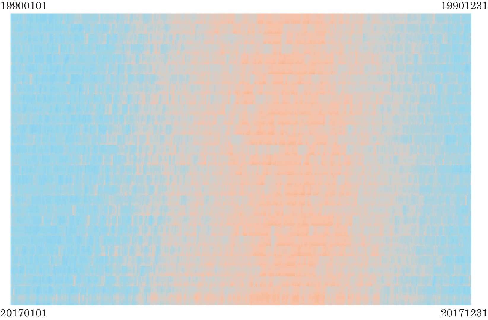
Tokyo is a generative artwork created by visualizing continuous recorded Tokyo temperature data obtained from the Japan Meteorological Agency from 1990 to 2017, and then printing out the result in a creative manner. The colored dots in the artwork reflect the temperature of each day. Cold days were colored in blue while warm days were displayed in orange. There are two primary reasons for using natural phenomena, such as temperature data in generative art creation. First, the data allows us to embrace and comprehend the unpredictability of natural phenomena. Second, when used with a generative algorithm, it makes possible data visualization in ways that allow us to create abstract art. Since there are massive amounts of historical temperature data, such artwork would be impossible to create without computers. Simple patterns like noise are not always random and often contain repeating patterns that can be expressed harmoniously. The seeming randomness of dots showing temperature distributions of hot summer days can be painted as patterns that result in abstract artwork. When applied to Tokyo temperature data, the stain-like patterns that resulted are among the most attractive characteristics of generative art painting and would be difficult to express without the generative algorithm.
Technical Information:
The artwork, which uses a generative algorithm for data visualization, was created via the following steps. First, Tokyo temperature data from 1990 to 2017 were extracted from a Japan Meteorological Agency database and processed for visualization. Then, 24-h temperature data for each day were arrayed and read in data buffers. The starting and ending dates on the four corners of the artwork are given as 19900101 (Jan. 01. 1990) to 19901231 (Dec. 31, 1990), and 20170101 (Jan. 01, 2017) to 20171231 (Dec. 31, 2017), and the temperatures during that period were visualized. The generative algorithm mapped the values of the arrayed data to the arbitrary color tones values set for each temperature. For instance, in the case of a cold day, the temperature data was assigned to a blue color tone value and then plotted in the artwork. Hot days were shown similarly in orange. The Tokyo temperature data execution results provide a clear visualization of Tokyo’s past and current seasonal changes, and artistically beautiful patterns appear periodically during each year. From a scientific point of view, since the orange dots that indicate hot days are more prevalent on the bottom of the latest year’s area, it is clear that Tokyo has become warmer and that there are more hot days than seen in the earlier years shown.
Process Information:
The purpose of this artwork was to visualize data related to natural phenomena via a generative algorithm. I was especially interested in the ways data visualization could express abstract patterns. Data related to natural phenomena are often complicated, but through the use of mining data, it is often possible to bring out their beautiful and straightforward characteristics. I decided to create “Tokyo” to show the city’s temperature changes from 1990 to 2017, and thus artistically display the effects of climate change via data visualization. I have lived in Tokyo for many years and have experienced the four seasons here over the entire time. However, I have sometimes noticed differences between the current seasons and those I remember when growing up. The past winters were colder compared with those more recently, and current summer days are hotter than those of previous summers. Therefore, I collected Tokyo temperature data and created a program that allowed me to map the data in my artwork using colored dots. In the completed work, warm days were expressed in orange, while cold days were shown in blue. It quickly became clear that the more recent lengths of orange-colored dot patterns expressing warm weather were longer than those showing past days, most likely because of global warming. Although I found this scientific proof of global warming by chance, I could feel the data visualization more empathetically when expressed in the form of an abstract painting.