Kurt Bakken: Flight
Artist(s):
Title:
- Flight
Exhibition:
Creation Year:
- 2002
Medium:
- computer art (light box)
Size:
- 30 x 48 inches
Category:
Keywords:
Artist Statement:
As a young artist, I was fascinated with taking a variety of subjects out of context and using them to create new visual realities. If the handling of these disparate pieces was done well, I could make the fantastic appear possible. I learned to airbrush and used this technique to make this synthesis happen. As time went on, imagery became less important to me. I began to focus on the intricacies of the patterns and textures I could create. This seemed like the right path until, in the early 1990s, I began working on the computer.
My biggest concern with making computer art has been the final form of the finished pieces. Looking at the prints I made, I asked myself what was missing? “Light!” I had been painting with light on the computer. After some investigation, transparencies seemed to be the ticket. To properly illuminate the images, I began building light boxes that not only displayed the transparencies, but also complemented them. People ask me: “Why don’t you just show your work on a monitor?” To me, getting the image out of the computer is akin to getting the vision out of my head. It’s not real until it’s an object.
Technical Information:
My most recent effort, Flight, was done using Photoshop and Painter. Scanned pencil sketches are often the foundation layers for my work. After that, I rely on the tools in Photoshop to build much of the image. Sometimes, I’ll have upwards of a hundred layers per finished piece. In Photoshop, it is not unusual for me to run a layer through several filters and other functions so many times, so rapidly, that days later I have no idea exactly how I got a specific result. Painter is also a very useful program. I use it for creating textures, and the image hose produces some interesting visual effects. This particular piece was limited to those two programs. However, I often use Poser or LightWave if I need 3D for an image.
After finishing the image, I flatten the layers and save it as a TIFF file. A service bureau prints my image using the LAMBDA process, which performs direct digital imaging to Kodak continuous-tone photographic material. This material is then developed using standard photographic chemical procedures. The end result is a transparency ready to be put into a lightbox I create for it.
Process Information:
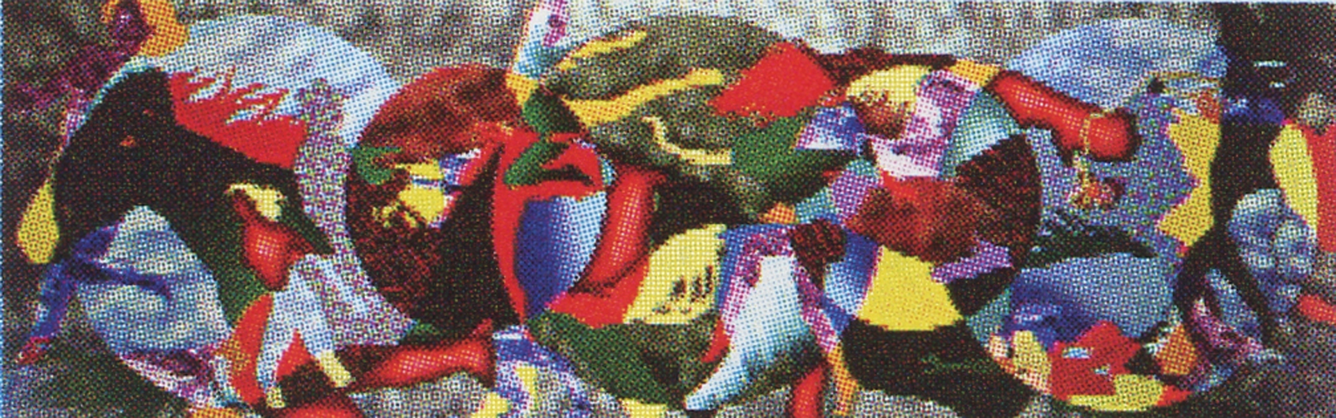
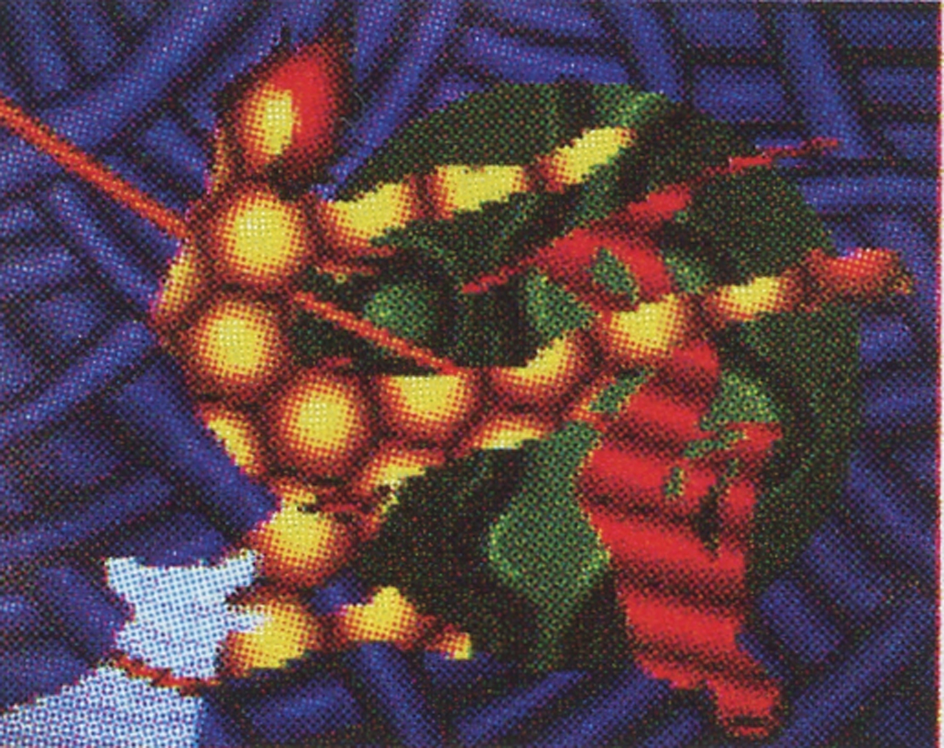
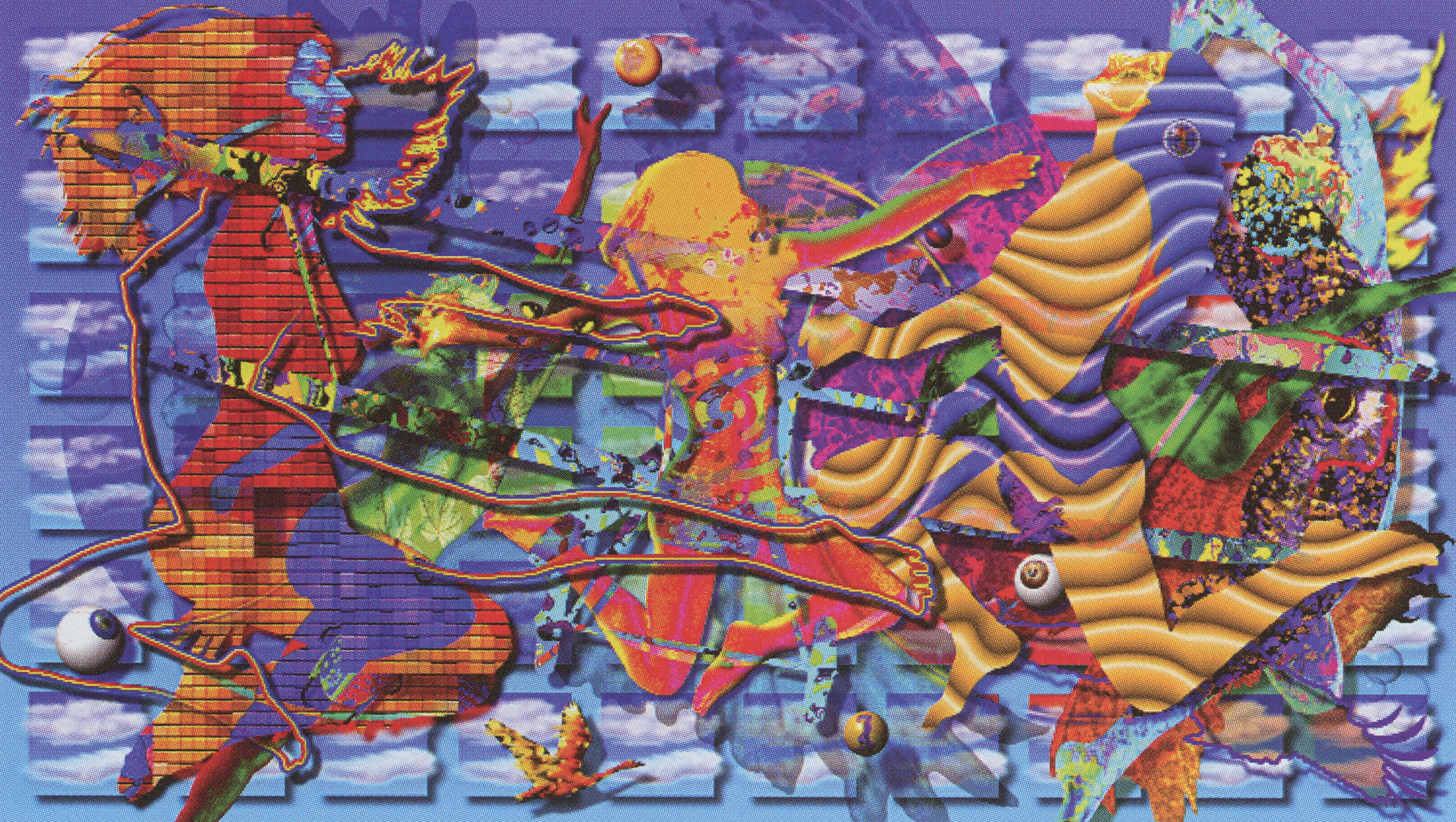
Actually the genesis for this piece began a decade ago when I was searching for new paths in abstraction. I wanted to experiment with more free-form methods of application in my painting, however, I had specific figurative imagery I wanted to explore. Along with these pursuits, I also wanted the ability to make objects appear to overlap and at the same time be transparent, so I could show all of one object even though it was covered up by another object. Using acrylic paint on canvas, I found that what went on inside the silhouettes became independent of the meaning assigned to the shapes themselves. The Big Roundup was an explosion of these concepts. By the time I painted Pheromones (toward the end of the series), my emphasis toward transparency gave way to a heightened focus on making the textures inside the shapes more bold.
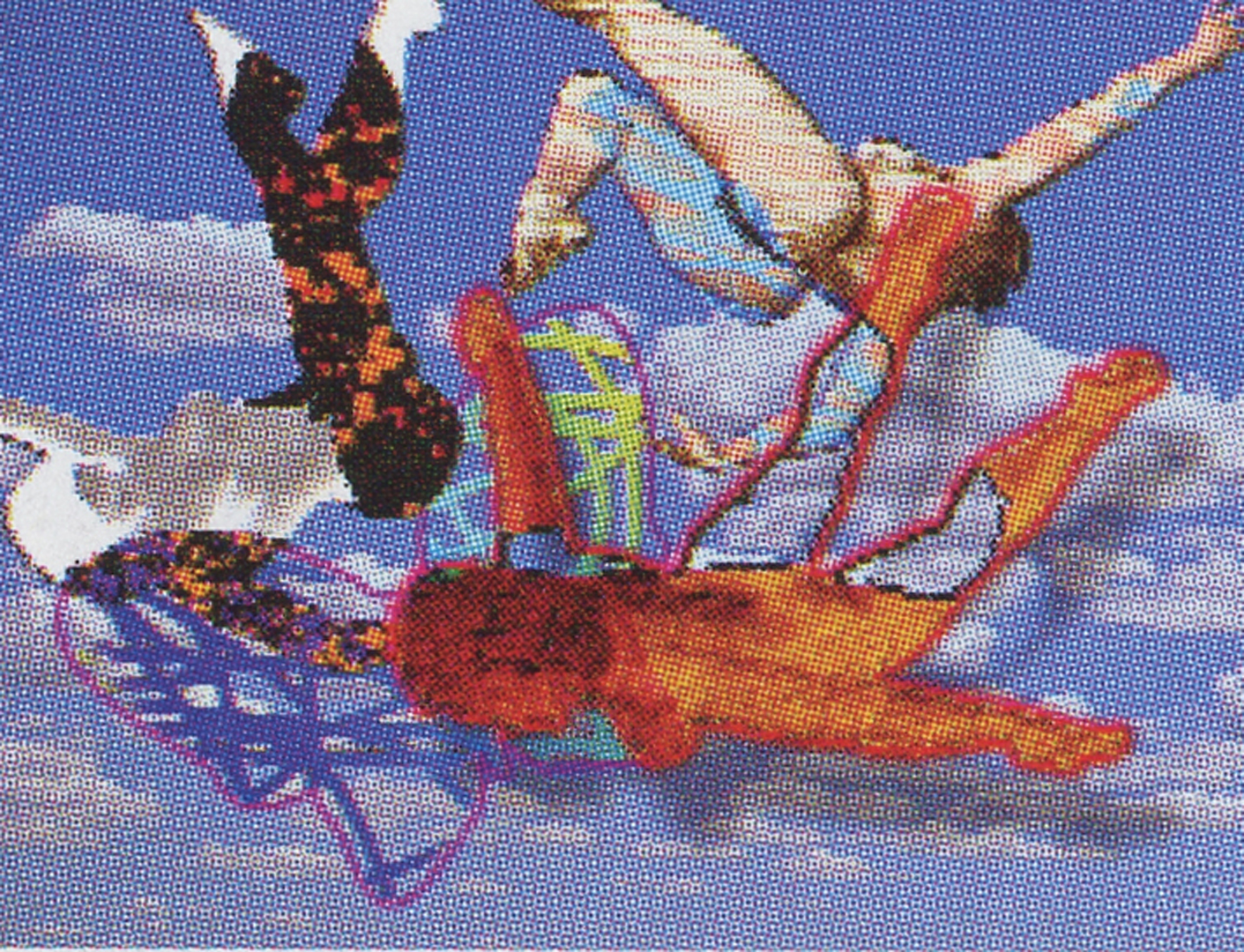
Midway through 2001, my interest in this abstract work was reawakened. I began messing around with the idea of “flying silhouettes,” in this early prototype.
After my initial digital scribblings, I decided to put down a foundation for a finished piece. I began by blocking in a basic layout. I knew the final piece would be fairly busy, so I wanted to start with some simple geometric shapes to build upon. I chose three interlocking circles. Interlocking circles have become a common motif in my work. Next, I began to “hang” objects on them to see how they would interact. I was looking for positive and negative space relationships and overall flow – making the figures “dance” together.
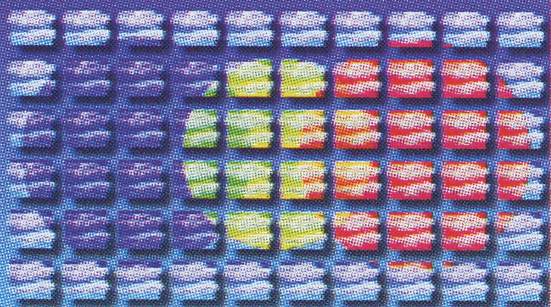
The piece was about flight, so I decided that it needed a sky background. However, it should be a synthetic digital sky. This gave rise to the “cloud” tiles. Also, I used the circle motif to color the sky. Using the primaries for the circles and secondaries for the overlaps, I created a rainbow metaphor.
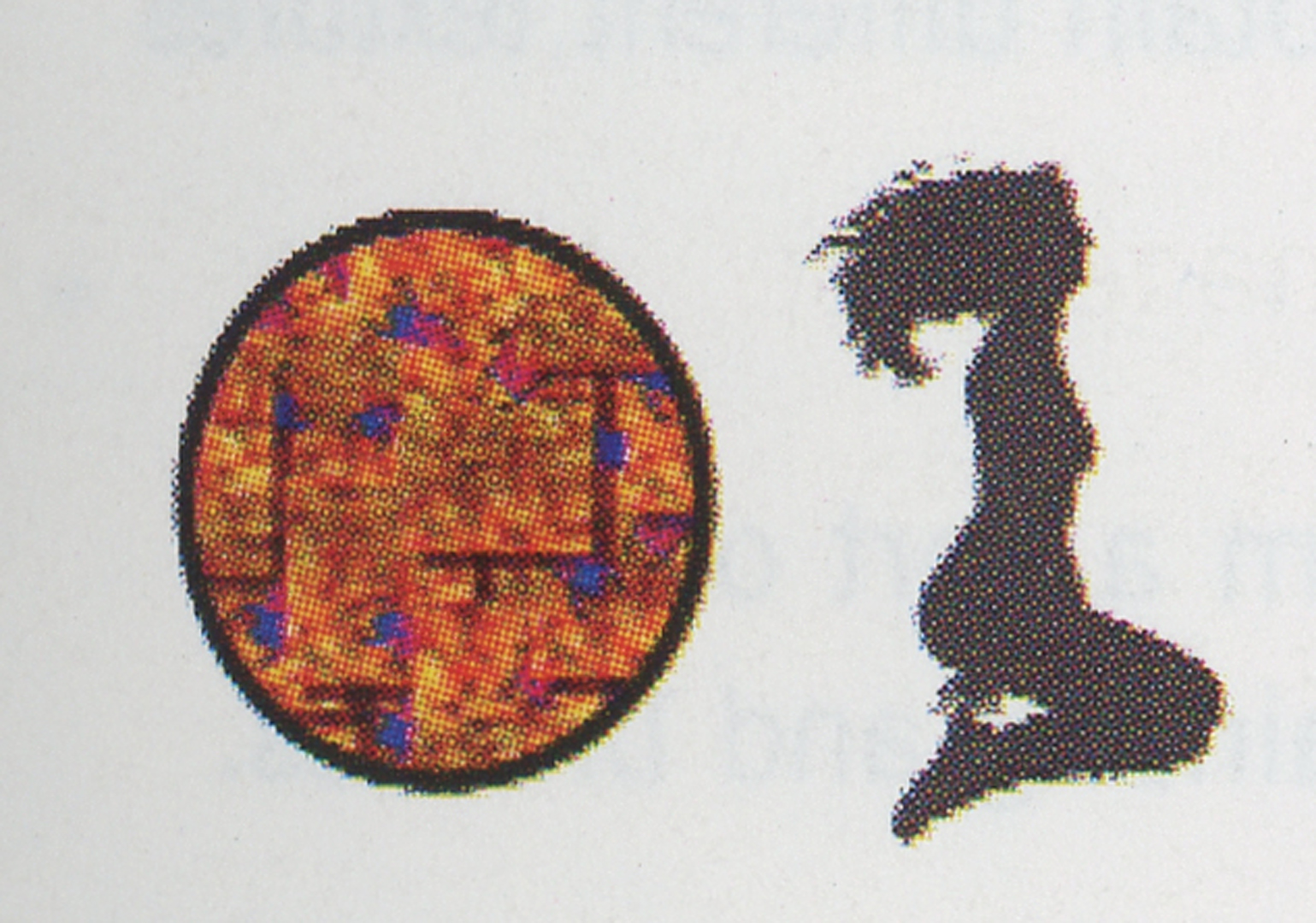
I brought in the first figure, and created two textures to use inside the silhouette. I split the figure at edge of the circle. I wasn’t satisfied with one of the textures, so I ran it through several filters and inverted it.
This figure and the next two are anchors for this piece. Even though they a re overlapped or underlapped, they are the prime focus of the image. Knowing this, I put special emphasis on the textures filling them. In this case, why I chose the shower floor tiles and beetles is beyond me. Creepy, huh?
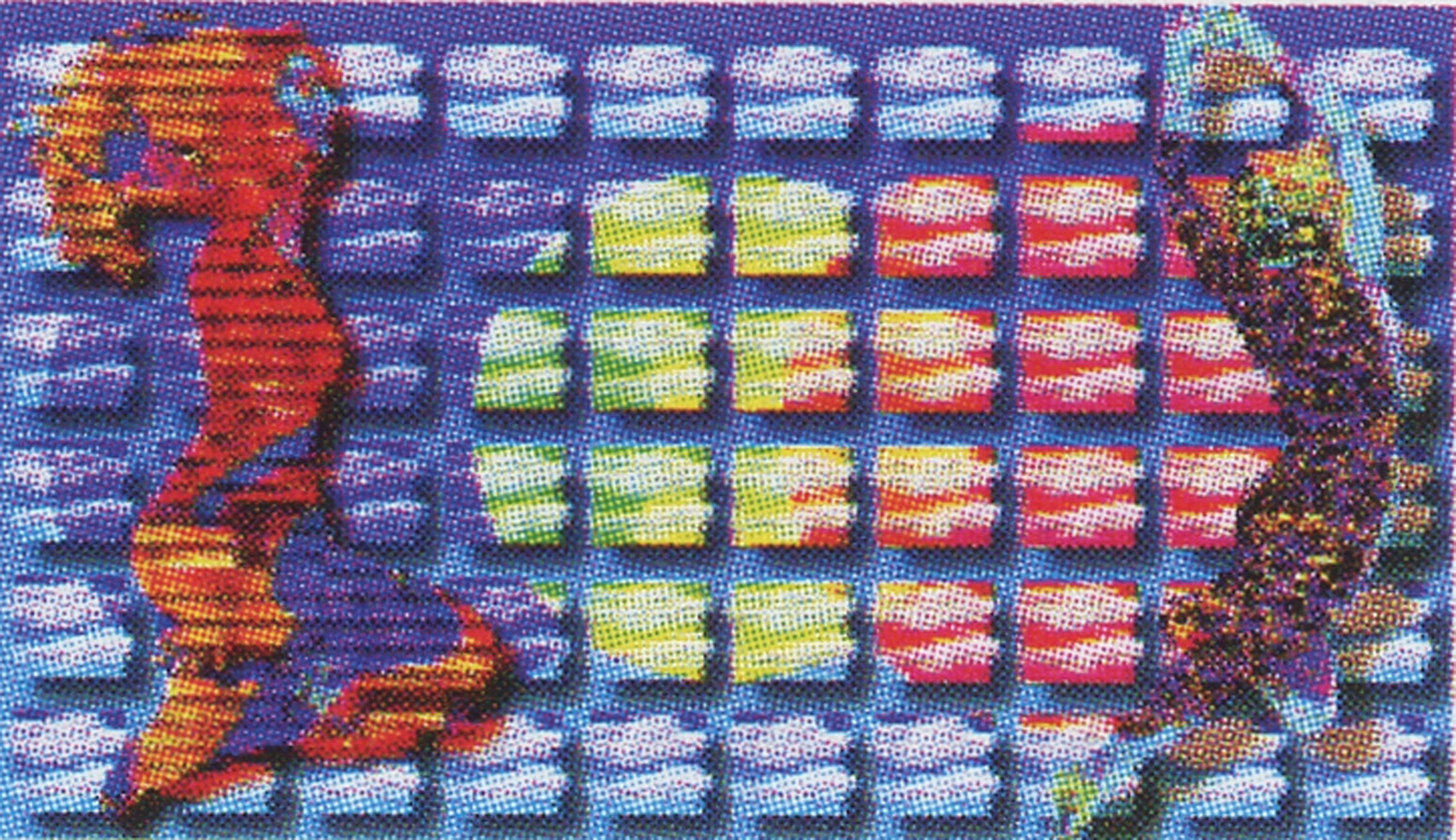
I especially like this silhouette because it breaks the edge of the red circle in several places. The purple pipe texture is derivative of elements in Pheromones. I changed the purple with the hue controls. You can see where I used the selection of a subordinate figure to underlap the yellow figure’s midsection with blue.
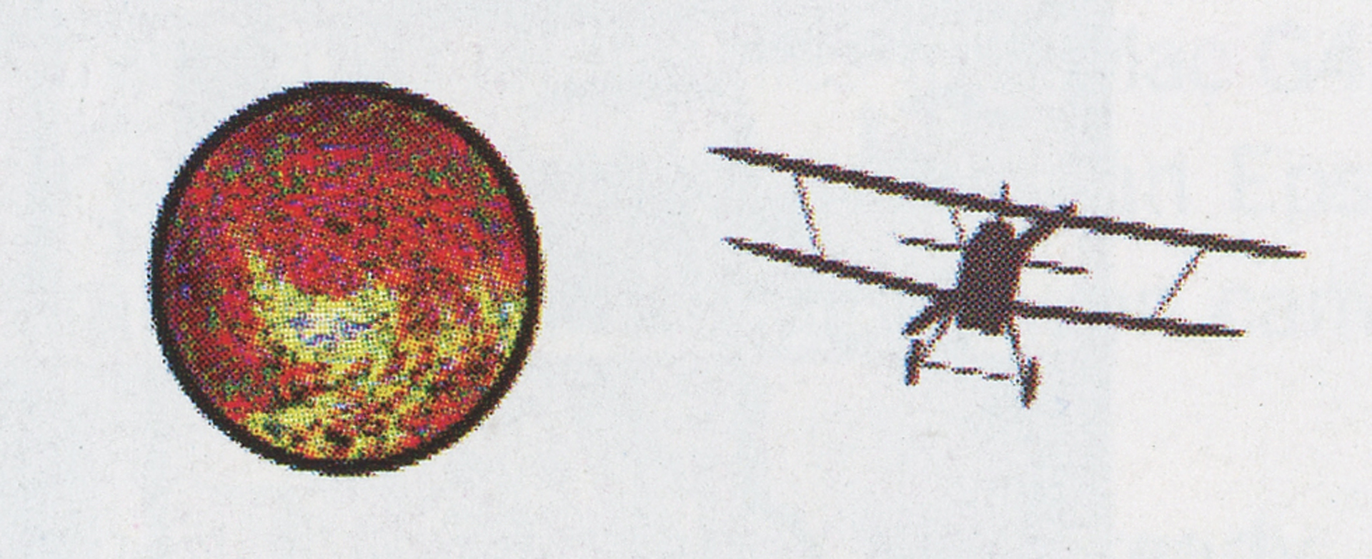
I wanted the center figure to create a spiraling vertigo effect. I used the random line texture to fill the silhouette. However, I sent the image through several filters and inverted it so many times, the texture was lost except for the color. You can also see hints of the biplane showing through.
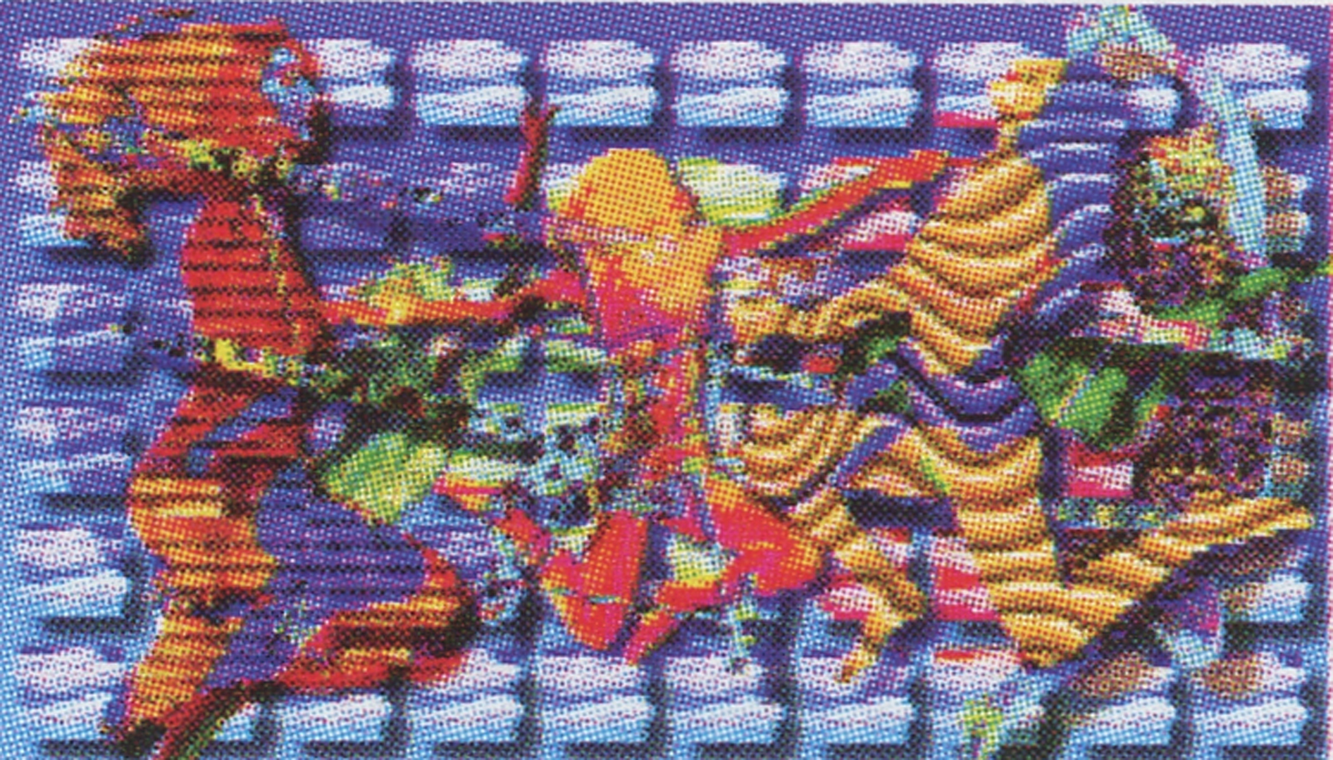
I added two more figures. The figure on the right was fairly straightforward. The figure on the left went through many layers of changes including offsetting the left arm.
For the plane silhouette, I only used one texture. However, I duplicated this object into many layers, sandwiching them over and under the figure layers. I then modulated their hue and transparency before using the figure’s inverted selections to cut them out.
At this point I put in the eyeballs, spheres and bubbles. Their purpose is twofold. First, they occupy dead areas in the picture plane. Second, they form “triangulations of sight” that keep the viewers’ eyes moving. I learned this little trick from some clever dead guys from the Renaissance.
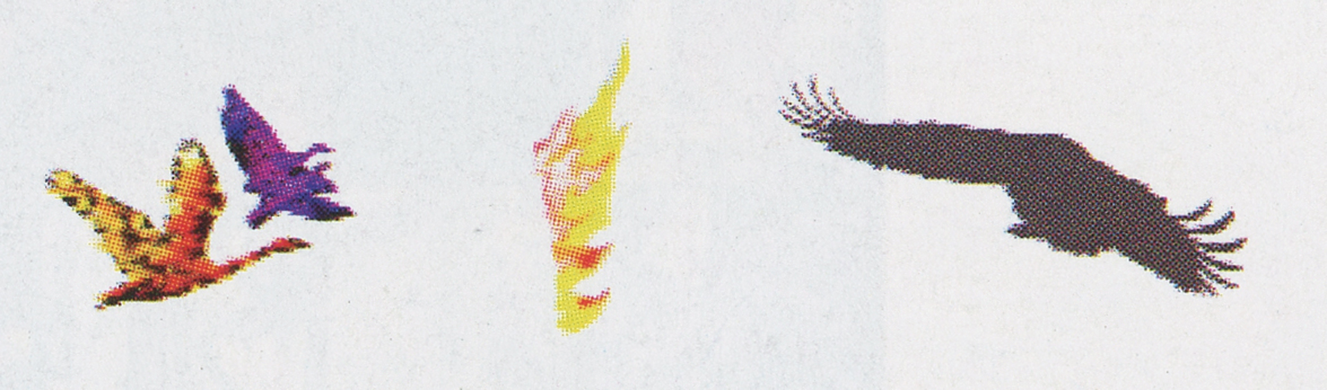
OK, I had flying women, an airplane, balls, bubbles, birds…..hmm no birds. Gotta have birds. Also, I like hot wings. One flaming wing please.
After some reflection, I still felt that there was too much background showing. I decided to go ahead and add the two large bird shapes I had put in the original sketch. After much massaging, adding textures, clearing textures, erasing and tweaking layer transparencies, I had the piece just about finished.
One of the challenges in computer art is knowing when to quit. With conventional materials, the painting will often tell you when you’re over the line. In this piece, the question arose, “Should I squeeze in one more flying naked lady?” Why not? You can never have too many of them.
Remember the circles I spoke of-the ones that were the geometric bedrock of this piece? Yeah, well neither did I. So, I reinforced them with a few strategically placed arcs. Finally, layer by grueling layer I went back and tweaked the shadows…and that made all the difference.
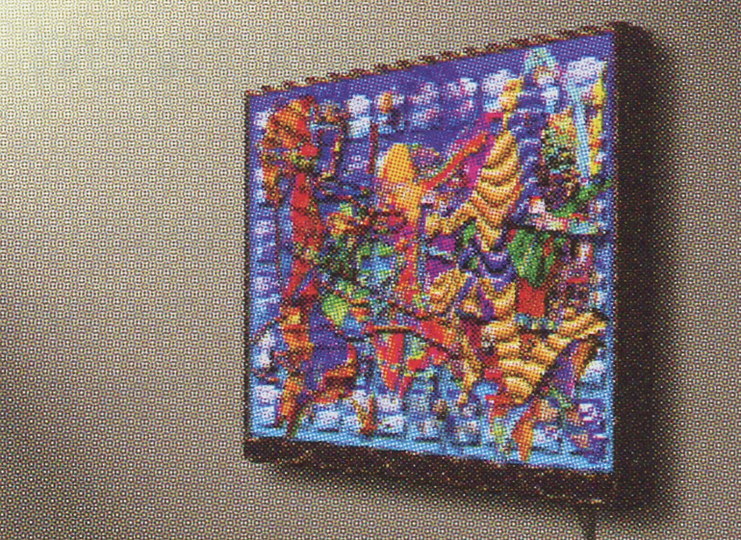
Now it was time to take my file to a service bureau. I prefer to make large transparencies out of my images and build light boxes to show them. I have seen many computer pieces reduced to color prints. They always look kind of dead to me. What we are doing is painting with light. Every stroke we make or function we do emits a new and different quality of light on the screen. Why, after working on an image for weeks or months, would you drain the life out of it by turning it into an opaque print?
Affiliation Where Artwork Was Created:
- Z-Axis Corporation
Other Information:
Images:
1: Big Roundup
2: Pheromones
Additional Images: