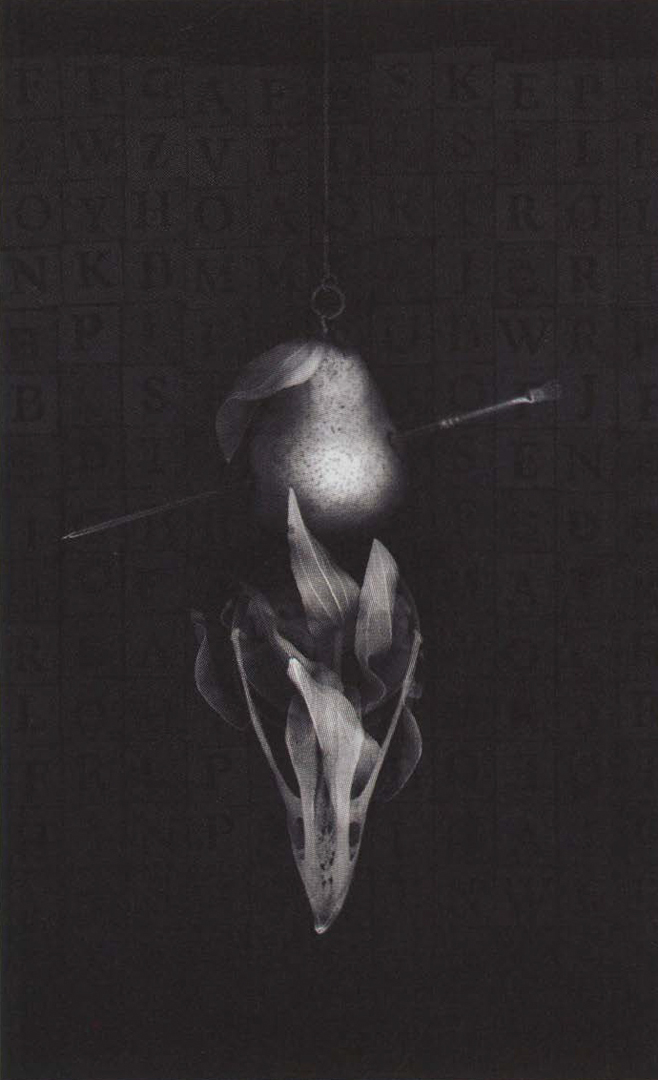
Viktor Koen: Vanitas No.23
Artist(s):
Title:
- Vanitas No.23
Exhibition:
Creation Year:
- 2004
Medium:
- Digital print on paper
Size:
- 17 inches x 23 inches
Category:
Artist Statement:
Vanity Studies is a series of still-life images based on the 17thcentury Vanitas paintings, depicting compositions of objects that symbolised the vanity of worldly things and the brevity of life. After initial research on the Vanitas theme, I turned my attention to compositional and aesthetic challenges, since the conceptual strength was established and would be consistent through the series, without specific ideas for each picture. This allowed for a more expressive process, since images were not dictated by their carefully selected title but from the spontaneous visual chemistry between objects that take on unconventional meanings and the need for different versions of images that had to be explored. Components of the traditional compositions were mixed with contemporary and technologyinspired elements, in order to graduate the symbolic value of the
imagery to the present. For an artist infatuated with technology, its shapes, and its surfaces, this series has been an opportunity to approach organic subjects. It helped me discover or, better, rediscover nature’s relevance as the foundation to all. This sharp thematic turn was possible in part because the Vanitas still-life was characterised by a prominently
displayed skull, a motif I consider visually stunning and symbolically potent. Vanity Studies refers not so much to the futility of seeking what does not last, but the surprising aesthetic qualities of the ordinary.
Technical Information:
The digital, on-screen creative process is not based on sketches or pencil studies, in order to achieve a more expressive result influenced
by the interaction of elements, through trial and error. By not determining concepts and compositions in advance, the images evolve in a fluid manner and utilise transparency and the textural attributes of the software. The only groundrule for the series was that no camera could be used. The raw photographic components are scans of individual objects at different angles, done in the dark, in order to take advantage of the natural distortion that occurs when the scanner lens tries to capture depth. The backgrounds are mostly found distressed surfaces of metal, wood, or plastic, and a layout of a large number of small objects of the same kind on the glass, in order to create grids or random piles. The accidental results of the scans contributed to the “loose” aesthetic outcome, even though each image went through several versions before printing. Adobe Photoshop 5.5 was used to connect and manipulate the sources into seamless visuals. Only the basic set of software filters and effects were utilised on the multi-layered files, completed in greyscale before they were colour tinted. I used an eight-year-old Agfa Arcus II scanner that broke frequently, exactly when the series was finished, or the other way around.


